Edit: This topic was originally called “Forgotten Spire by Goosifer”. I’ve changed the theme for the Zoo Tycoon 1 version of this project to be Atlantean-themed, hence the change.
This is kind of interesting because I never released it back in the day but I did finish it more-or-less. At ZooMania I ran a contest between modders. Every round there would be a theme and every round two would get eliminated until it became 1v1. If I recall, ShenTirag won the contest with her Waterfall Fountain. The rest of the entries were never released either, but I will be putting them up at some point later this week.
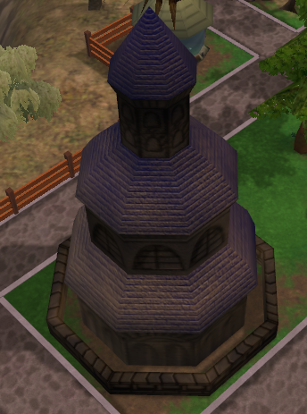
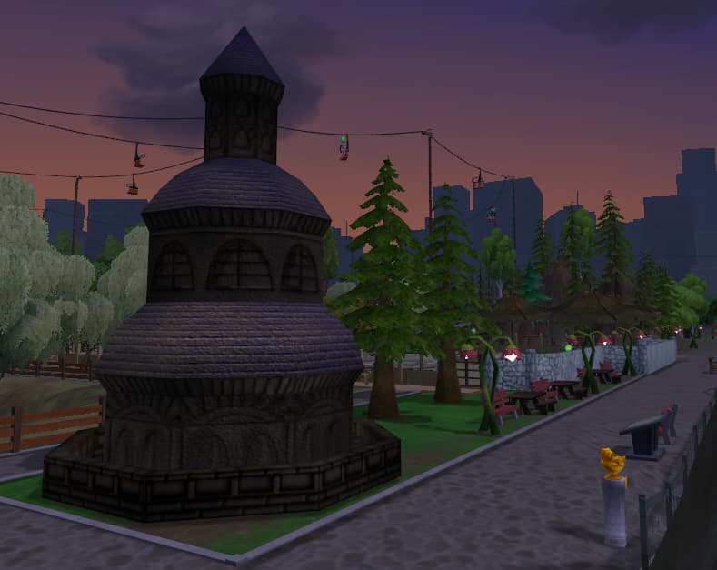
Anyway, here is what I made back then for that tournament (it lost :P):

Originally I called it ‘Ancient Castle’ but it’s not much of a castle is it. I’ll release it in the next batch of mods to backup on ZooBerry, but I also want to see if I can port it over as a ZT1 scenery item. Would be good practice.
1 Like
The Zoo Tycoon 2 version of this project has been released here: Forgotten Spire for ZT2
The ZT1 version is coming up next after I finish the hotdog stand.
1 Like
I’ve finished making the assets for the hotdog stand and have sent to Fern. Just a few kinks that need figured out but other than that not much else I can do on the meantime as we figure those out.
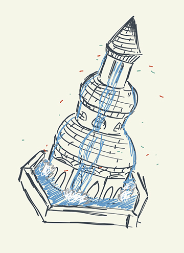
I’m calling it on the ZT1 mod-making for tonight and moving on to other projects but before I close shop I wanted to share what I have in mind for the spire. I’m making it into a fountain for ZT1. It’ll be an interesting challenge animating 2D water I think. Here’s sort of what I have in mind:

Wish me luck 
1 Like
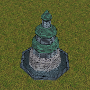
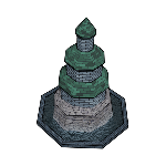
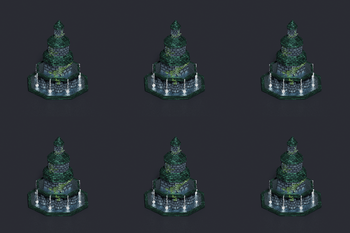
An early look at the forgotten spire fountain for ZT1. I’ll be redoing the texture instead of the one I made 15 years ago:

A bit more progress made on the fountain. I changed the title of the project to Atlantean Fountain. It’s not very original but I mean look at it. At least now with the new title it has a sort of ‘lore component’, or why there is water coming out from the sides. It’s silly but I like that it makes sense to me now.
I added a few textures and effects. I’m not too concerned with the UV map accuracy since the final sprite will be tiny anyway. Nothing is final so still lots of improvements coming for lighting, textures, etc.

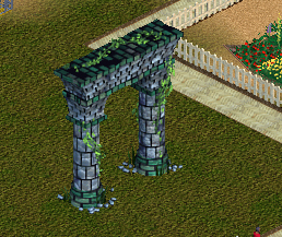
I’m using the vanilla Atlantean Archway as the inspiration for the design:

I’m trying best to get as close to the original theme. Some colors are off but I think I can fix that in either post processing or when I can get the lighting right. I’ll also give it some vines and rubble like the arch has.
A few more things I’d like to improve by next update:
- Water brightness
- base brick brightness

Is it convincing-enough as an atlantean-themed object?
1 Like
I messed around with the model some more today. I removed the rock below the tower and replaced it with another fountain bed. I’ve decided that instead of waterfalls I’ll be using animated bubbles instead.

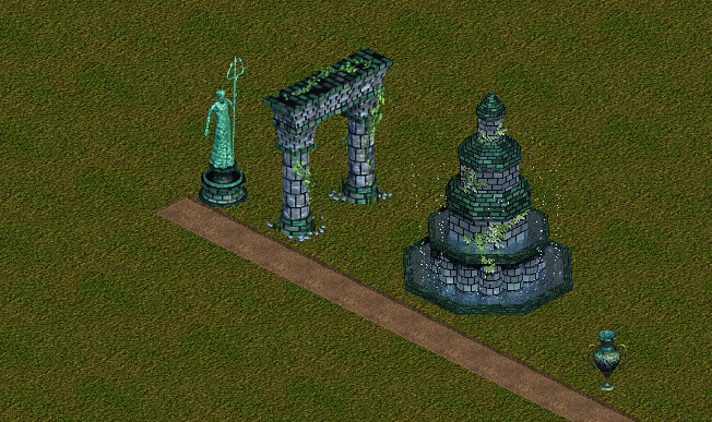
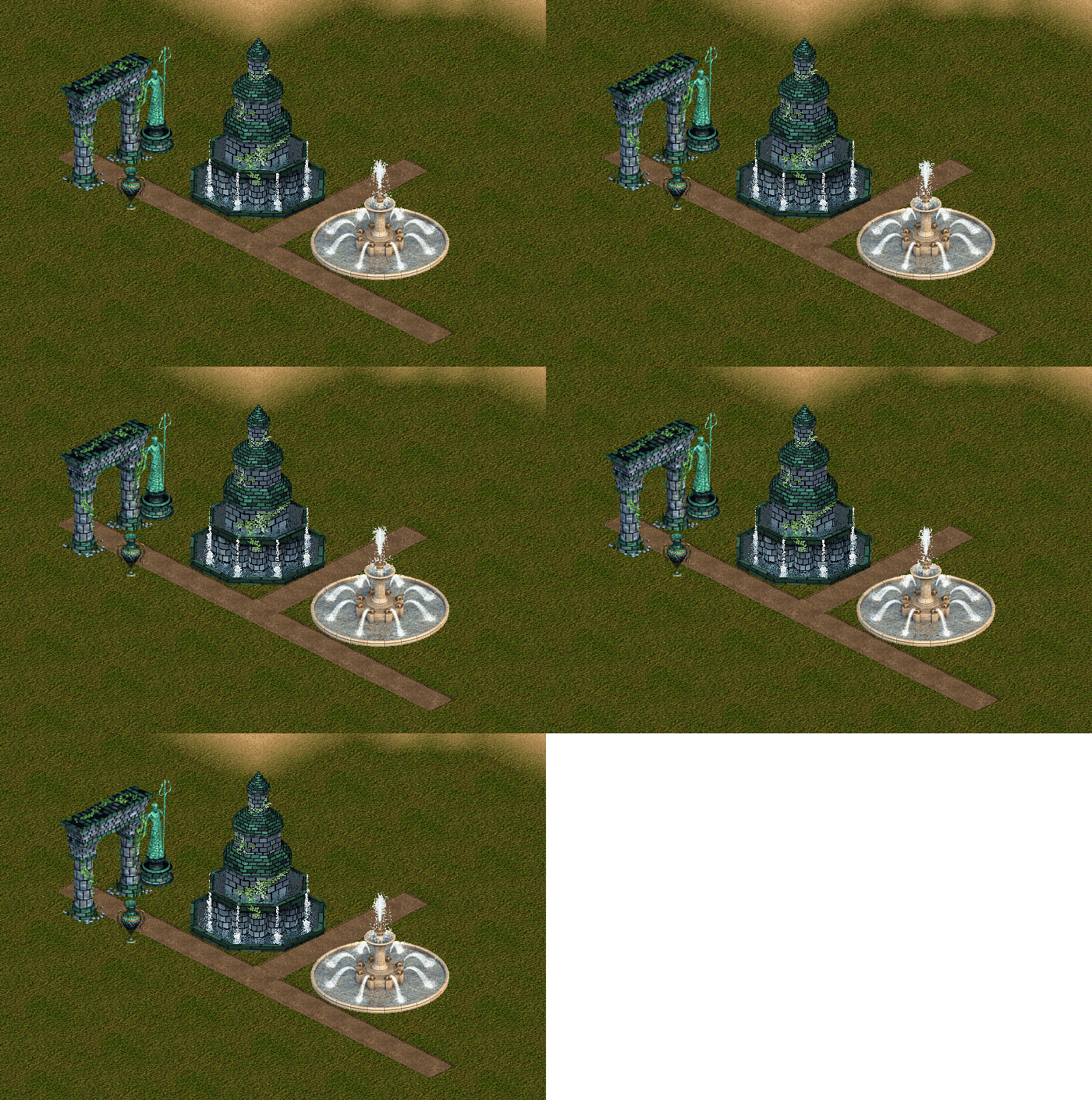
What it could potentially look like in-game:

1 Like
I couldn’t make the bubbles look that great. By popular demand over at Tek, I’ve gone with a water trickle coming from the second water bed instead. I also added a few water spouts coming from each corner of the octagon so that it makes sense where the water is pouring from.

Still a few funky issues with the particles (if you can tell) but I’ll get those sorted.
1 Like
I think I’m basically done with this project. Not sure what else to do. To my eyes it looks…fine?
Since the last update I:
- Adjust the camera angle to fit with with the game grid a little better
- Animated the water beds
- Did some light post-processing
- Updated the lighting to avoid the harsh shadows
I think I might start configuring it soon unless anyone is able to catch something.

1 Like
Oooooh this is starting to look really great! Do have three potential nitpicks though if you don’t mind.
Firstly, it looks like one of the water trickles is pulsing on the bottom left, I assume this is a rendering error since all the others look fine but it’s pretty hard to ignore once you see it.
Secondly I don’t think the trickles should be reflected in the water, to match the other fountain, also seems like some of the water bounces a bit when impacting the water on the turtle fountain so that might be something worth replicating too.
Third, and this might just be me, but it looks like the water’s rushing a tad too quickly compared to the other fountain. It might be best to have a side by side gif with all the other fountains to see how well it meshes into the crowd.
Overall though I’m loving this so far, it has come a long way already and it fits in great with all the other Atlantean themed objects. Definitely open to using it a lot in the future once it releases. I’m extremely picky when it comes to things fitting in with the ZT1 style but this is one of the few modded objects that I think really captures the style the game has going on to a tee.
1 Like
Awesome tips, thanks! I updated the reflections so that it functions similarly to the other fountain.
Sadly the animation above was done in photoshop. The object works fine and is animated in-game now, but due to the limitations of colors I can’t include more than 2 frames per view without Zoot throwing a fit so the animation looks a lot less compelling.
Trying to see if I can increase the frames some other way.
1 Like
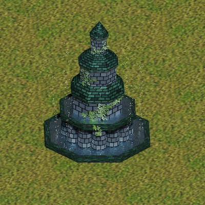
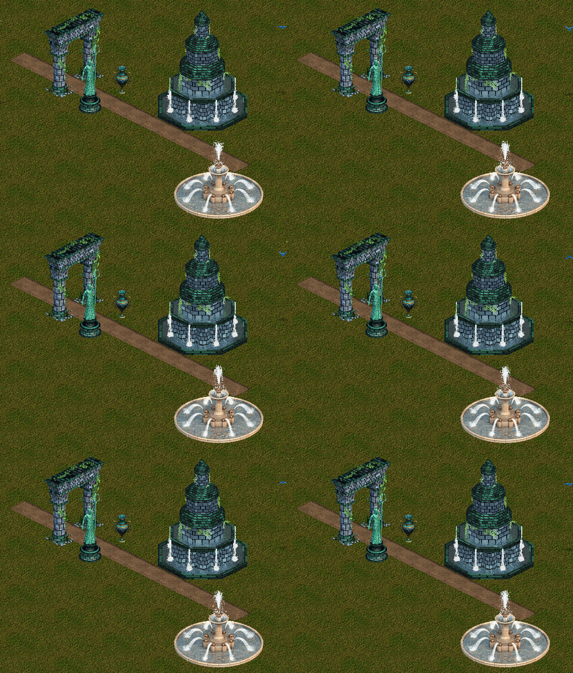
I managed to get the frames up to 4 from 2. I wish I had the time to keep fighting Zoot with its 8-bit graphic limitations and increasing the number for a smoother and cleaner water animation. I probably can but school starts up soon and frankly I’m ready to move on  . Here is the final version before release!:

The gif loop restarts in a weird spot so it’s not completely representative, but this pretty much what it looks like in-game. Rotations, icons done. Configuration mostly finished so release should be pretty soon!
1 Like
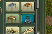
Can you post the icon pls, I’m curious as to what it looks like there. Assuming you’re using the same colour as the rest of the theme does ye?
I’ve actually been ‘signing’ my mods with my own custom icon xD.


1 Like
Very fond of the patterning these icons have going on, has a very nice look to it.
I feel like it’d be neat to see it colour coded still like the base icons tho, at least for themed objects so people can easily tell what theme it’s from at a glance. It’s not really an issue for this object in particular because of the distinctive brick colouring, but I could see it being useful to keep the colour coding going in case some item’s themes are harder to tell from a glance, or you make objects for a completely new theme entirely so we can easily tell what bits are part of that theme without needing to hover over it. (Though ultimately that’s a fairly minor suggestion and if the coloring is important to the signature it’s probably best not to mess with it.)
Ohh yeah that’s a good point. I have to be honest: I’m not a fan of the vanilla icons and it’s the only thing I haven’t tried too hard to emulate  Most everything else I want to keep as close to vanilla in style and function.
I think I’ll end up coming back at some point and update the icons once I have a better idea how I want to handle them.
1 Like
The Atlantean Fountain is out now and can be downloaded here: Atlantean Fountain by Goosifer
I will release an alternative with bigger bonuses later for those that want to play just for fun. Will also release an asset pack later this week.
1 Like
